I have noticed that some Rotary Clubs in our District are altering the Rotary logo for use in the marketing and promotion of their various events and projects.
This sends the wrong signal to the public. Many do not know who we are now and with different “looks” to our logo just makes it worse. Please use the Rotary Voice and Visual Guidelines ( see : https://my.rotary.org/en/document/tell-rotarys-story-voice-and-visual-identity-guidelines-rotarians ) and USE ONLY THE ONE ROTARY LOGO in your marking and public relations initiatives. That would include your website , all social media sites and any signs you may have created. We continue to strive for One clear consistent look and message in all that we do, to ensure that everyone knows our “Rotary” message.....
For many years, our Rotary wheel stood alone as our logo on signage and communications materials. Although the words Rotary International were embedded in the wheel, they were hard to read from a distance. As a result, the general public did not always recognize Rotary’s involvement in a project or activity. That’s why we decided to expand our official logo to include the word “Rotary” next to the wheel.
This is our official logo and our masterbrand signature, which should be used whenever possible.
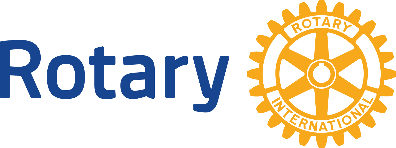
The Rotary wheel is our mark of excellence. In addition to being a component of our official logo, it may be scaled up for greater impact and used separately but in close proximity to the masterbrand signature.
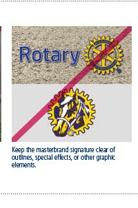
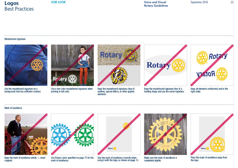
In the Rotary Voice and Visual Guidelines ( see : https://my.rotary.org/en/document/tell-rotarys-story-voice-and-visual-identity-guidelines-rotarians ) , be sure to look at page 22: Logos: Best Practices.
Please be careful not to incorporate the use of these ideas into the Rotary logo.